Ok love Logo Rebrand Design Process
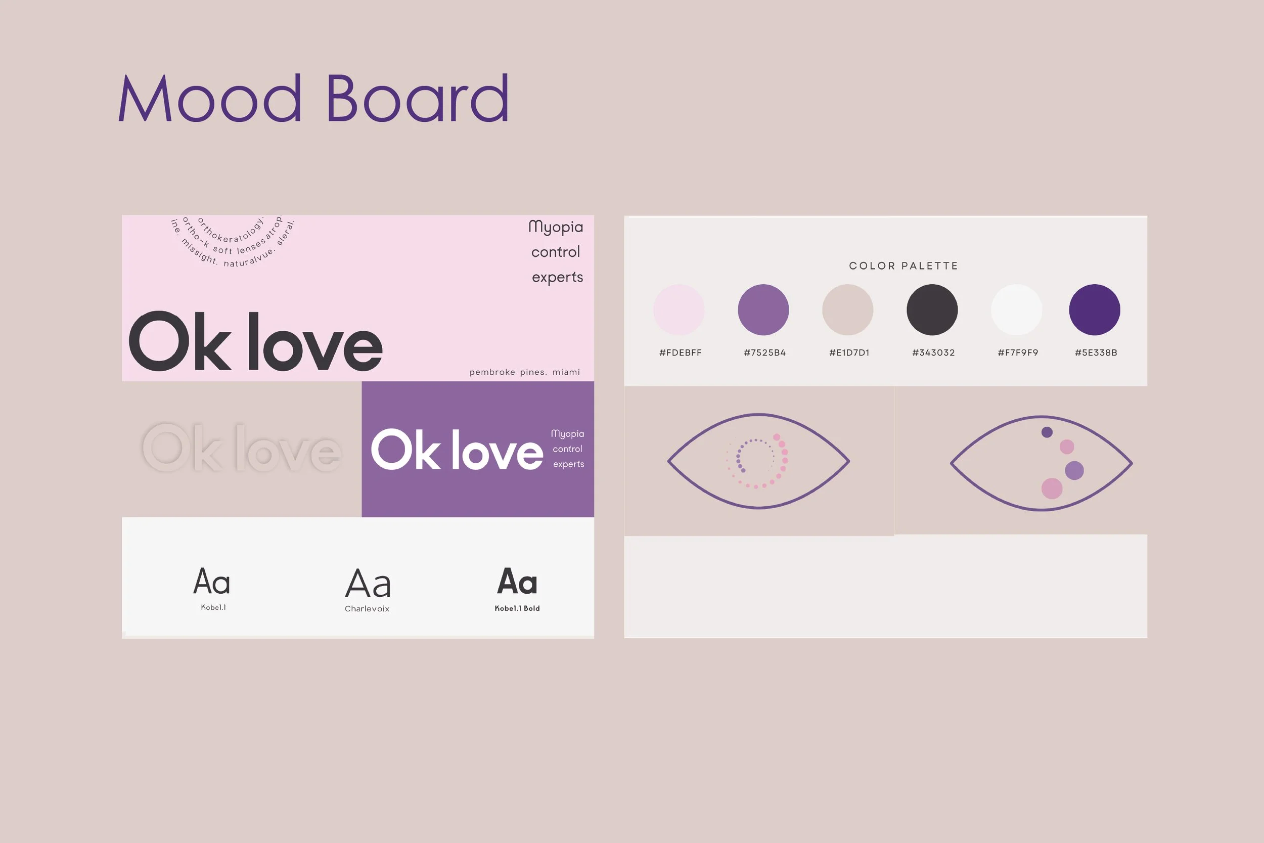
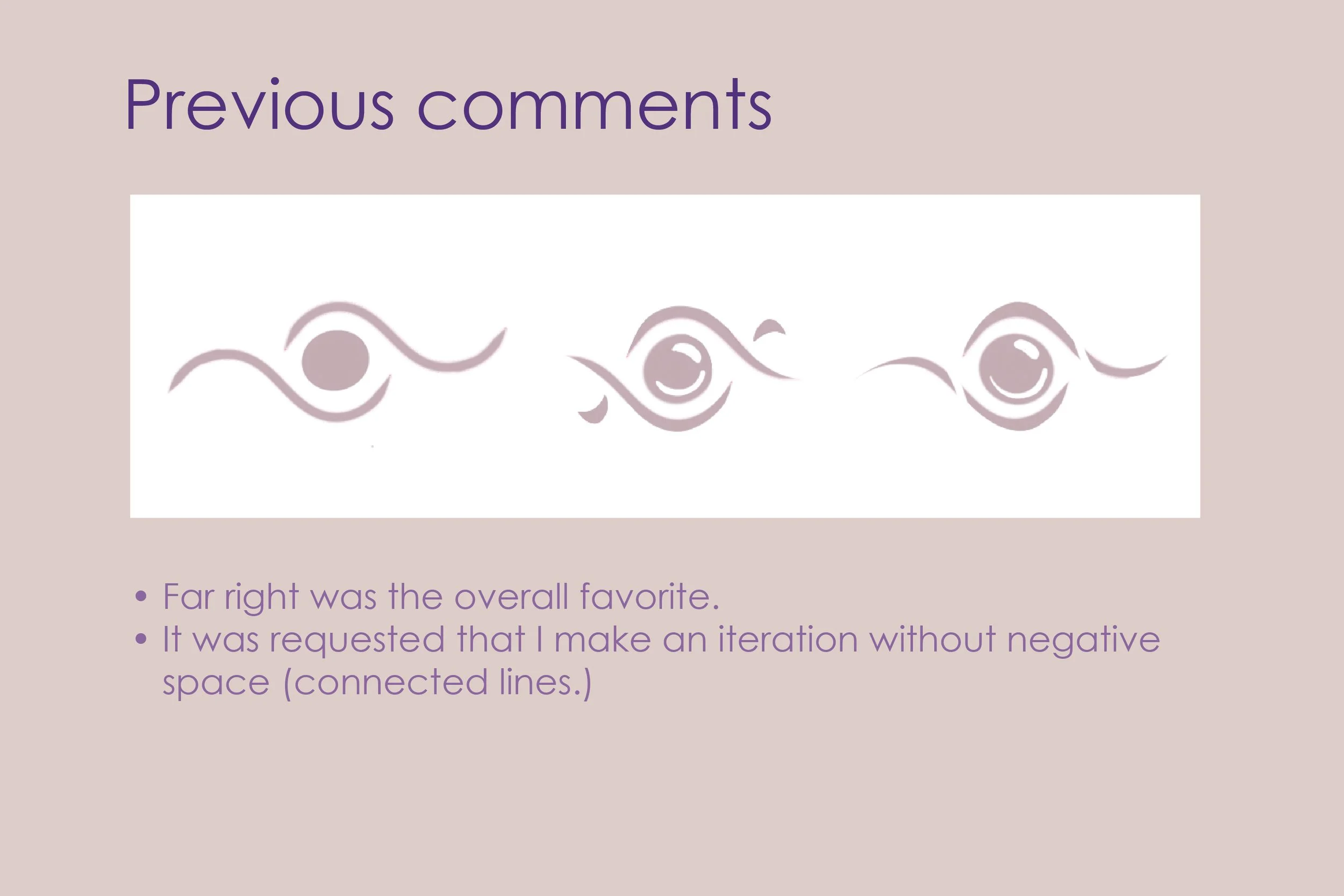
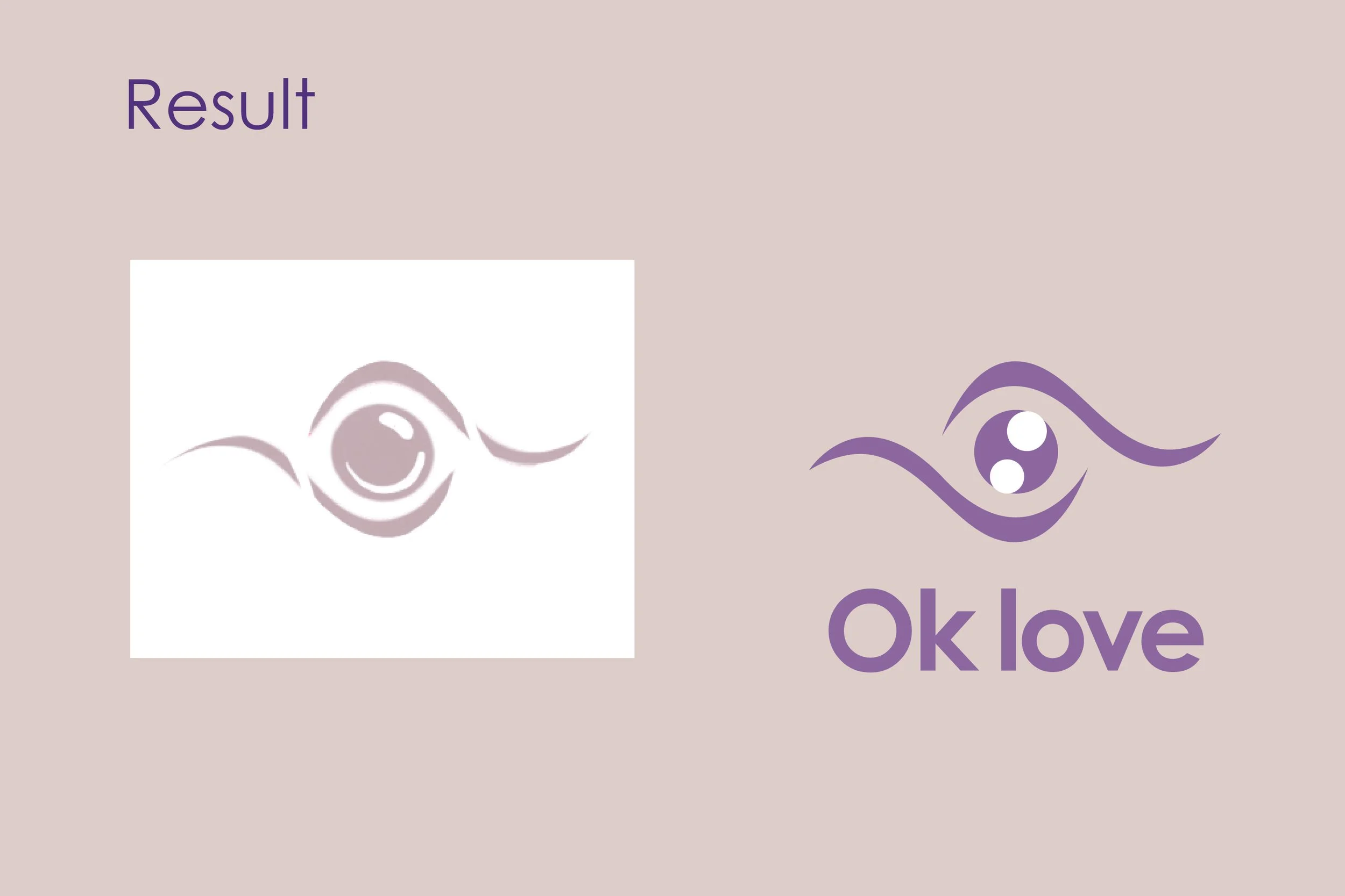
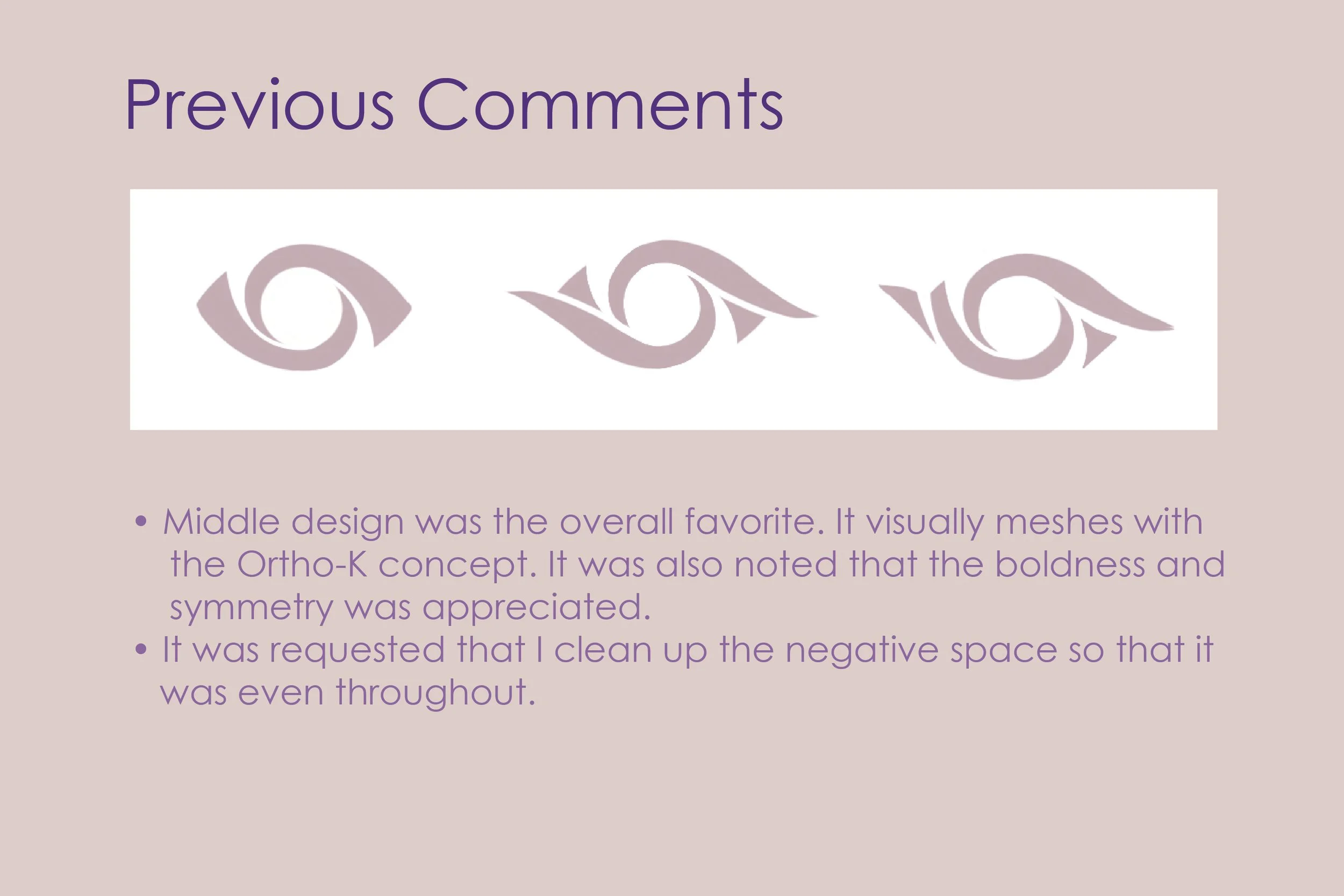
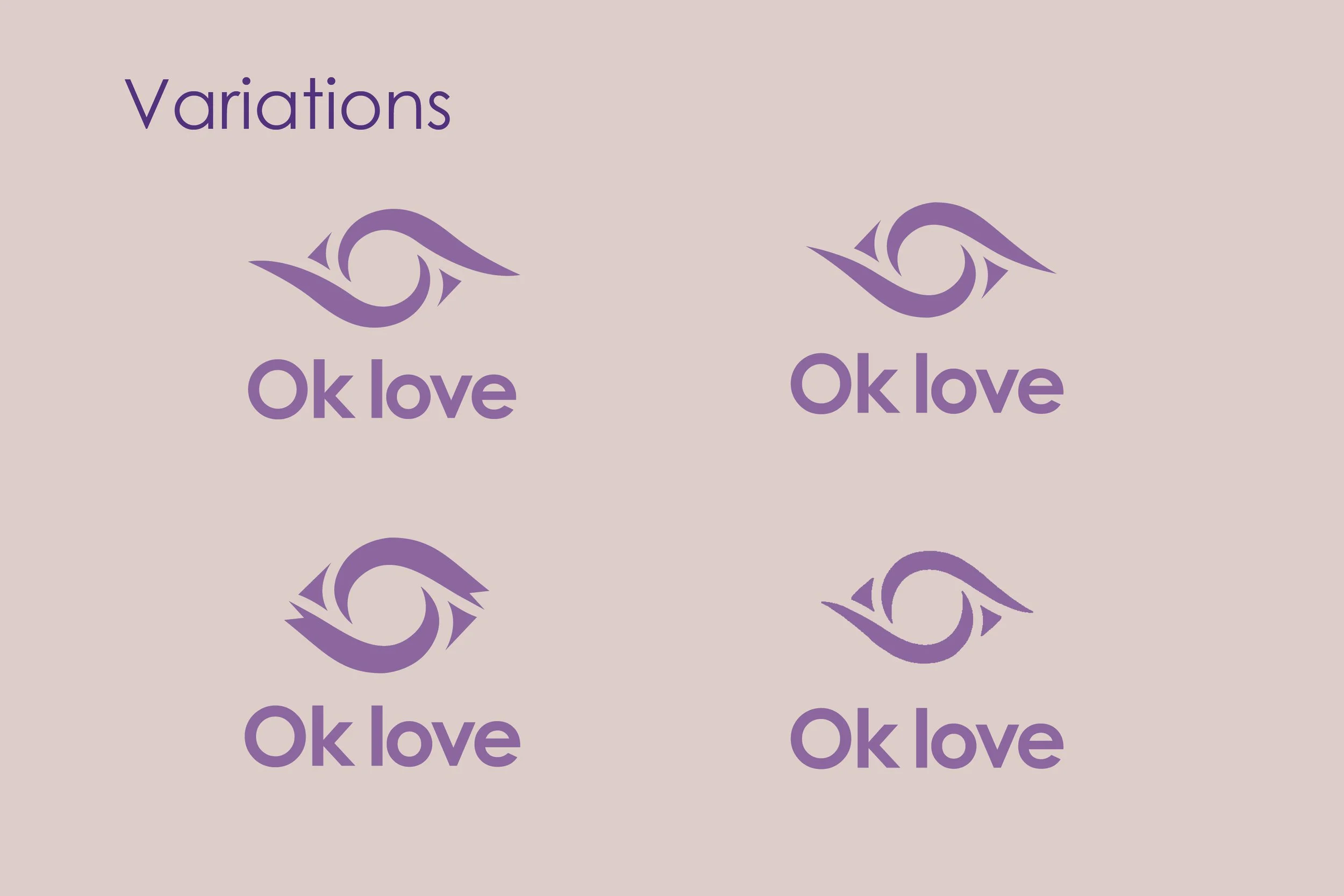
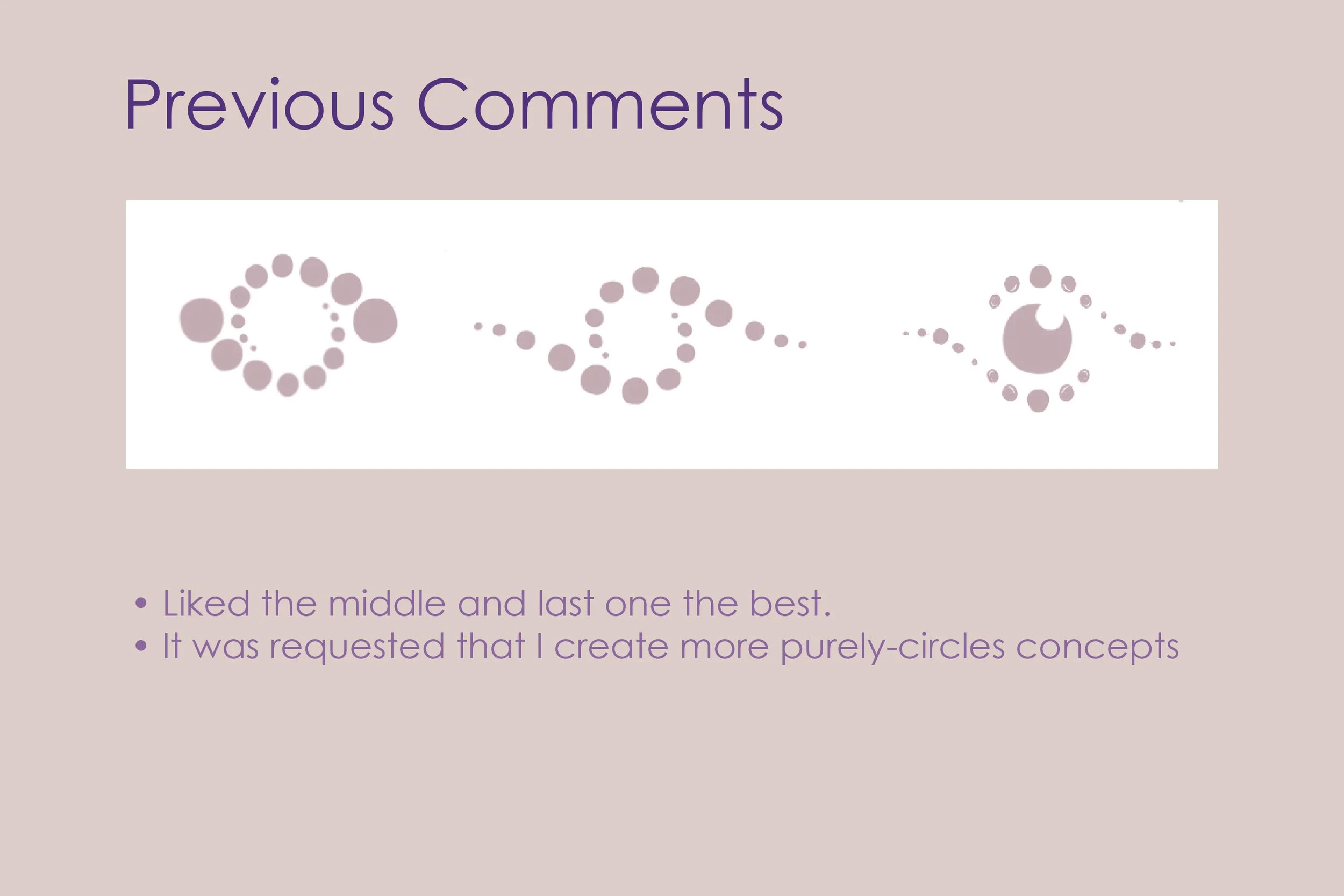
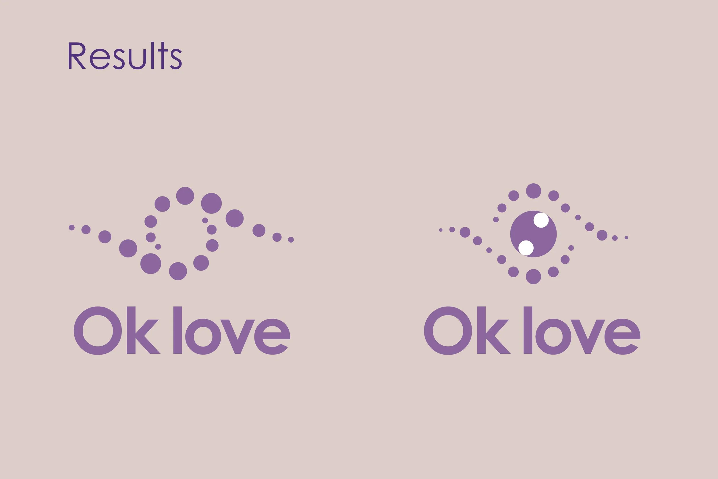
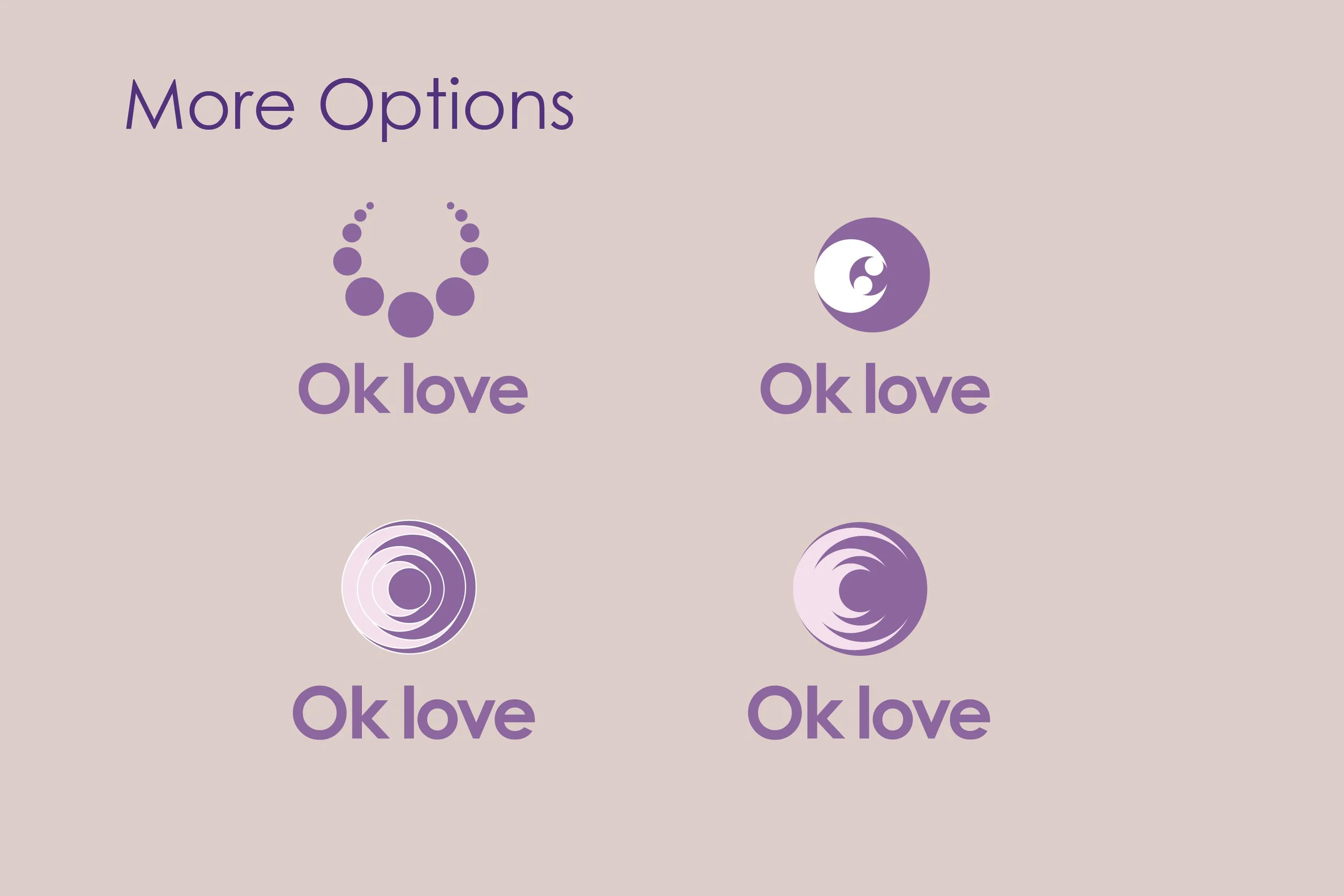
This logo was created for an Optometrist who narrows their focus on Myopia Control and Orthokeratology. This project is a great example of clients having a vison for their brand ahead of time. Font preferences, colors and a few preferences regarding the graphic were provided. The slideshow below shows the many directions this logo could’ve taken. After the variety of options were discussed, the client leaned more towards keeping key aspects from their original logo, but revamping the overall look.
Old Logo